Extended Practice
Thomas Squire
Archives


BRIEF 14: DEFINE - Typography Structure
Development of Typographical Structure
Before designing the publication in InDesign I trailed a range of typographical structures for the magaizne which used a standard set of formats that I will require for the publication such as styles for body copy, titles, quotes and caption. Using this basic structure I text a range of different typefaces styles mixing both sans-serif and serif together. As well looking at weight, a typographical ornamentation like bold and italicised text. The most productive styles that I had produced was the use of Serif font for headings and titling combined with a light weighted sans-serif font for the body copy, captioning and quoting.


BRIEF 14: DISCOVER - Visual Research
I had already predetermined that the format of the publication to be presented as a magazine, I’ve chosen this format about upon on the content that will be held inside, as the publication will feature articles as well studios that i’ve explored I felt a magazine format would be most appropriate. For this reason I visually explored a range of printed publication that had similar to content of my cop publication.
+Tumblr.jpeg)


.jpg)


.jpg)


BRIEF 14: DISCOVER - Audience
For people looking at the body of work I have produced within the third year, the design context publication will provide and background and underpinning as to the context in which all of the works whether it be the sector or format of work that has been produced.


BRIEF 12: DEFINE - Cover Development
The photography team went away and talked to the rest of the photography students and as a group they came up with a group of names for the yearbook, through process of elimination they decided on ‘Not Good With Words’. Using this name as a basis we looked at produced a front and back cover for the cards. We had decided on using an X-band to hold the cards together this influenced how we designed the cover, it was important to think about how this obstructs the covers and how this can be used advantageously. We looked at two different layouts however we felt the designed in which words were cut off the cover reflected the name visually as well mirroring how the cards in the pack overlap each other and are cut off at the edges.


BRIEF 12: DEFINE - Developing the Grid + Proofs
After developing a grid of images that we were happy with we curated this same grid digital within illustrator. We explored two idea, one in which images overlapped onto other postcards and another in which they remained in the grid but images didn’t overlap. We presented these two ideas to the photography team. After some discussion we decided that having the images overlapping each postcard was a strong idea and that they worked well as both individual postcards as well as a series when placed all together. After this meeting we want away and tweaked some of the postcards as some of the images either overlapped too much or some overlapped too little. We developed the idea of having the image overlap outside of the grid so that a continuos grid of images could be created, on a wall for example.


BRIEF 12: DEFINE - New Direction
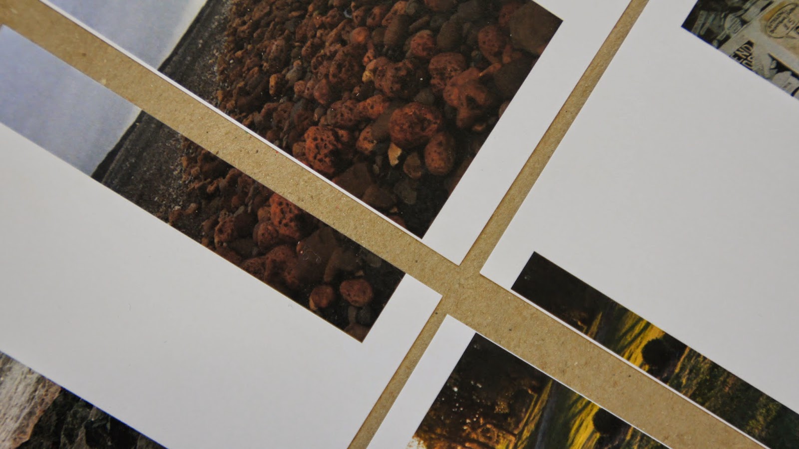
After again meeting with the Photography team we discussed the work we had produced thus far, although the team were happy with the work we decided that the idea was a little too safe and we needed to be a bit more experimental with how we used the format of the postcard. We then discussed the idea of having the images positioned on the postcard in a range of different ways and this was to be decided as a collection and to also think about how each image relates to the next images. As a result of this discussion we went away a printed all of the images and began a curation process in which we printed all of the submitted work and placed them into a grid of images which were matched together based on a range of criteria from colour, composition, style and tone.


Subscribe to:
Posts (Atom)
Copyright 2011 All rights reserved