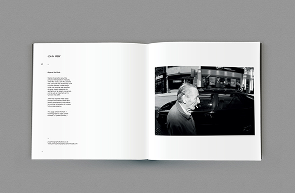
Within the meeting the course Tutor brought previous years yearbooks for us to look at. In the year previous to this course didn't have a yearbook produced by the graphic design course they instead produced postcards individually as a course. The years previous to this both had full yearbooks produced.
Infinity - 2012
The infinity yearbook for students who graduated in 2012, used the traditional square format for the book. Inside students had been given between 1-2 double page spreads to showcase there work, this was decided dependant on the type of work they produced. The yearbook was printed on a matt stock throughout with satin cover which featured a spot varnish. A layout features a range of composition again which were dependent on the images and the style of work.
Unseen - 2011
The 2011 yearbook unseen, is printed on a satin stock and is of extremely high quality as students raised money to fund the higher production costs. The same approach as the 2012 yearbook has been applied to it’s design.
We discussed the potential pro's and con's of producing a full year versus using a completely different format. Although all parties were in favour of a yearbook and liked the format the general consensus from the photography course representative was that a format like postcards would be more appropriate to this graduating year, in a course discussion previous to this meeting the students on the course had decided that postcards were an ideal format as with postcards people are getting printed ephemera which they can use and put on the wall for example whereas with a yearbook it's just a book that ends up on a shelf and never gets looked at. We also discussed the possibility that if postcards is the chosen format this should lower print costs meaning more units can be produced.
Plan of Action before next meeting:
- Talk with phil about the possibility of using a different for the Yearbook


Leave your comment