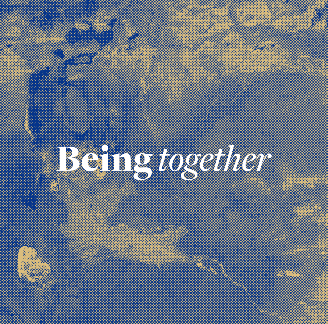
The first visual concept that we've explored is the use of these beautiful satellite images of earth taken from space. We found these images on the internet and felt they had a a unique visual quality that really showed earth from a new perspective. They also mirror the types of patterns and textures we'd gathered within out visual research.
Initially we explored a range of Photoshop filters which could be applied to images which would give them the ability to be screen printed. We also started to look at colour choice here and looked a blue and gold however upon reflection these colours don't reflect nature and raw aesthetics that the brand values. We also began experimentation with several Serif typefaces, we looked at using serif typefaces because they communicate history and heritage and the brand is about embracing humanity as we are all a result of each other and where we've come from so we felt this was apt and appropriate.
After deciding that the gold and blue colour is not communicating the right brand message we decided to tweak the palette to better reflect natural colours, however we wanted to stay away from the cliched browns and greens. We therefore looked into colours which stem from rich deeps colour like clays and berry's like that used in ancient history. In discussion myself and eve felt like this colour was much more productive however we did feel like it still felt slightly too feminine to attract a strong and adequate male audience.


Leave your comment